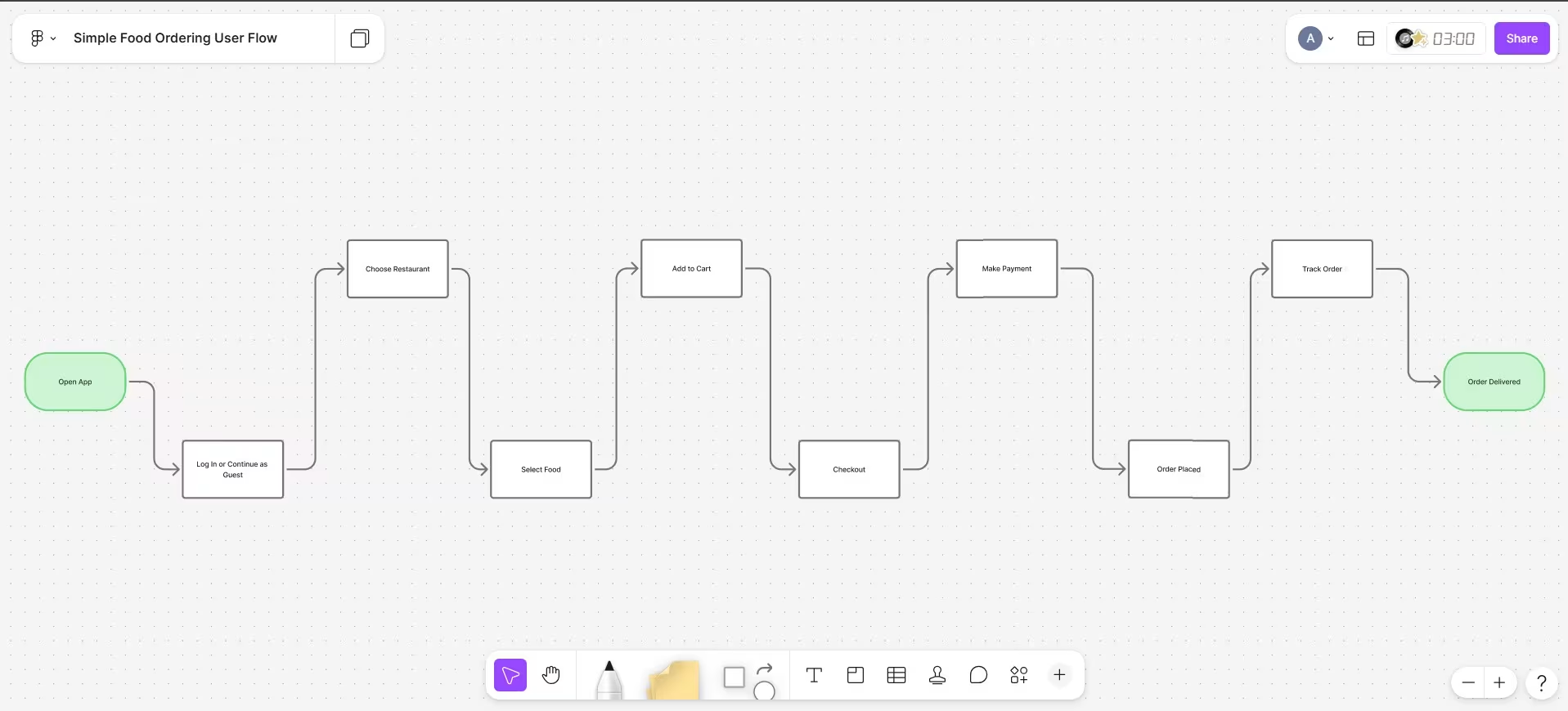
Many mobile application founders and product managers are constantly spending thousands of dollars on marketing campaigns to acquire new users. They are looking at download charts, hoping that a spike in installation rates will translate directly into business growth. However, they are often overlooking a massive leak in their sales funnel: the journey that happens after the user opens the application for the first time.
If your digital product has a clunky navigation structure, confusing buttons, or a tedious checkout experience, you are actively driving your hard-earned users away. The customer journey, which designers call the user flow, represents the sequence of steps a user takes to accomplish a specific goal inside your application. When this flow is broken, your conversion rates will drop, your customer acquisition costs will increase, and your business revenue will suffer.
The Hard Truth: If you are forcing users to think about how to navigate your application, you have already lost them. In the modern mobile economy, convenience is the primary currency.
What is a Broken User Flow?
Friction is the ultimate enemy of mobile application retention. It can manifest in several ways, often starting during the initial onboarding sequence. Many companies are making the critical mistake of asking for excessive information, such as phone numbers, profile photos, and location permissions, before a user can even see the interface.
Another common friction point is the lack of visual hierarchy. When everything on a screen is screaming for attention, nothing gets noticed. If your primary action button looks identical to a secondary back button, users will make mistakes, feel frustrated, and close the application.
We must also talk about the checkout flow. A user who has added an item to a cart or selected a subscription plan has already decided to buy. However, if they are met with mandatory account creation steps, rigid forms, or a lack of localized payment options, they will abandon the process. Each additional screen or form field will decrease your conversion rate by a measurable percentage.
How Major Apps Win and Lose
To understand the immense financial impact of user flows, we can look at the actual revenues of major global platforms. These companies are spending millions of dollars optimizing minor navigation paths because they know that even a tiny fraction of user friction will destroy their revenue.
| Application | Estimated MRR (Monthly) | Estimated ARR (Annual) | User Flow Impact Details |
|---|---|---|---|
| Tinder | $160 Million | $1.9 Billion | A 10% onboarding drop-off would cost them $190 Million in lost ARR. |
| Duolingo | $41 Million | $500 Million | Deferred registration boosted user retention and added tens of millions to their ARR. |
| Netflix | $2.8 Billion | $34 Billion | A minor 1% drop in signup efficiency would cost them $340 Million in ARR. |
1. Tinder: Progressive Profiling
Tinder is currently generating an estimated Monthly Recurring Revenue (MRR) of $160 Million, which translates to a massive Annual Recurring Revenue (ARR) of $1.9 Billion. For a dating platform, the onboarding flow is exceptionally complex because it requires photos, preferences, and location data.
If Tinder's product designers allowed even a 10% drop-off in their onboarding flow due to a confusing interface, the company would lose $190 Million every year. By utilizing a progressive profiling user flow, where users are guided through simple, single-question screens, they are keeping their completion rates high and protecting their ARR.
2. Duolingo: The Power of Deferred Gratification
Duolingo is generating an ARR of approximately $500 Million, with a Monthly Recurring Revenue of $41 Million. In their early days, Duolingo forced new users to register and create an account immediately upon opening the app. This flow caused a massive drop-off rate because users were unwilling to commit their credentials before testing the service.
The product team made a strategic decision to redesign the user flow. They introduced "delayed registration", which allows users to jump straight into a fun, interactive language lesson. Only after completing the lesson and feeling a sense of achievement does the app ask the user to save their progress by registering. This simple flip in the flow significantly increased their daily active users and contributed millions to their ARR.
3. Netflix: The Frictionless Checkout
Netflix boasts an ARR of $34 Billion, generating over $2.8 Billion in MRR. Their entire business is built on a subscription model. For Netflix, a frictionless signup and checkout process is critical.
If a clunky credit card input form or a confusing plan selection page caused a tiny 1% decline in checkout completions, it would translate to a loss of $340 Million in annual revenue. This is why Netflix keeps their onboarding flow incredibly lean, requiring only an email address and a password before taking the customer to the plan selection and payment screens.
4. Command-Based Flows: A Cautionary Tale
On the other side of the spectrum, we can look at the rise of command-based social applications. In recent years, several platforms launched to massive viral hype, attracting hundreds of thousands of signups in their first week. However, many of these platforms relied on complex user flows where users had to input specific text commands or memorize gesture shortcuts to perform simple actions (like sharing photos or sending updates).
Because the interface lacked clear visual navigation and forced users to memorize a command dictionary, the user flow suffered from high cognitive friction. Once the initial viral curiosity wore off, these platforms struggled to retain their active user base because the daily experience was simply too difficult for the average customer to navigate.
Calculating Your Loss
Let us calculate the cost of a poor user flow for an emerging SaaS or mobile application. If you are currently spending $10,000 per month on marketing to drive 5,000 installs, your acquisition cost is $2 per install.
If your app has a clean, optimized user flow with an onboarding completion rate of 70%, you will successfully onboard 3,500 active users. However, if your onboarding flow is confusing and has a completion rate of only 40%, you will only get 2,000 active users.
In this scenario, a poor user flow is wasting 1,500 users per month. To replace those lost customers, you would have to spend an additional $3,000 in marketing costs every month. Over a year, this invisible leak will drain $36,000 from your budget, and that does not even include the lost lifetime value of those customers.
How to Fix Your User Flow
If you want to stop losing customers and maximize your recurring revenue, you must audit your mobile experience and implement a user-centric design strategy. To understand how this works in practice, let us look at a simple, relatable example: a ToDo List Application.
Imagine a user who has downloaded a ToDo list app to jot down an urgent reminder. Instead of allowing them to quickly enter their task, the application immediately blocks them with a mandatory account registration screen, email confirmation prompt, and a tedious onboarding slideshow. Feeling frustrated, the user closes the app and deletes it. To fix this, we can analyze the key areas of improvement and apply optimization patterns to turn this friction into a high-converting experience:
- Simplify Onboarding (The Onboarding Fix): Onboarding is the gateway to the customer journey. Let users type and save their first few tasks instantly in a temporary state. Delaying the registration prompt until they need to sync tasks across multiple devices builds immediate trust, showing the value of your application before demanding commitments.
- Reposition Key Buttons (The Interaction Fix): Place critical action items within the natural thumb sweep zone. Move the "Add Task" button to the lower 30% of the screen. Designing a large, colorful tap target makes interacting with your application feel smooth, natural, and effortless.
- Show Instant Success (The Feedback Fix): Provide instant visual confirmation to reassure the user. When a task is added, animate it onto the screen immediately with a micro-animation instead of displaying a loading spinner. If they leave the input blank, show a friendly helper message inline to guide them positively.
By simplifying the path from app installation to value discovery, you are creating a seamless experience that encourages customers to stay, engage, and purchase. High-end UI/UX design is not a luxury; it is the core engine of your business revenue.
Is a Clunky User Flow Silently Draining Your App's Revenue?
Do not let bad design choices ruin your marketing efforts. Our premium design team at Adverchitects specializes in building intuitive, high-converting mobile interfaces that turn downloads into loyal, high-lifetime-value customers.
Success in the modern mobile landscape is reserved for companies that prioritize the user journey. By focusing on creating intuitive paths and eliminating navigation friction, you will build a loyal customer base and secure sustainable growth for your application.
Summary and Key Takeaways
Optimizing your user flow is not just about aesthetics; it is a critical business strategy that directly protects your conversion rates and monthly recurring revenue. The onboarding experience serves as the gatekeeper of your entire customer journey. By simplifying the path to value and eliminating unnecessary registration walls, you can prevent costly drop-offs and dramatically lower your user acquisition costs.
Ultimately, a successful mobile app provides visual clarity, intuitive thumb-reach interaction, and instant feedback. High-converting user flows turn downloads into active, loyal users, ensuring a positive and sustainable return on your design investment.